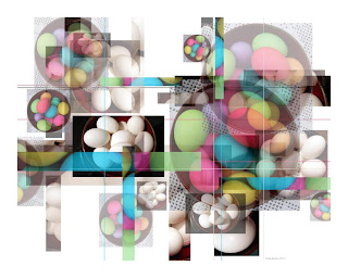
Now I’ve
taken another step in the developing of my composites. I decided to try overlapping images rather
than just placing them side by side.
Making some of the photographs semi-transparent added another dimension
and added to my fun. I use an old Adobe
computer program to work on my images. (Many photographers refer to their
photo-program as their digital darkroom.)
Originally this piece had only silverware images. I can’t live well without color, so I tried a
number of other kinds of images. I was
happy to find that the green and red worked well with the silver. I liked the feel of the organic plants with
the precision of the manufactured utensils.
This composite is quite similar to the “Forks & Berries” image in its structure. I was happy to have some circles, the bowl, and ovals, the eggs, to oppose all the right angles formed by the borders of the images. I found that it was challenging to decide when enough was enough. I used some intuition to help balance the images – I considered dark & light, bright& faded, square & round with a few lines for fun.


No comments:
Post a Comment